Devhaus Rebranding
Creating the new brand book to bring the brand to life
Devhaus is an education technology company that aims to bring personalized learning to everyone by AI-powered insight engine. Working with the senior brand strategist, marketing specialist, and other designers, an updated brand strategy is developed.
They’re not just learning.
Not just performing. They’re transforming.
Into something more than even they thought possible.
Because there’s magic in us all.
To bring the brand strategy to life, this visual identity aims to find the balance between high-technology and humanity. The soft gradient colour is added to the sharp “D” logo to warm up the identity. The butterfly is the manifestation of the magic that Devhaus helps you free. The gradient circle as a data point is applied in “Butterfly” and also as a supplement element of the entire brand.
The logo is minimal and distinctive, formed by dots that represent the data insights generated by Devhaus’s learning model and the lines that connect these insights to our end user. A simple gradient created by our colour palette brings both a sense of illumination and transformation to create a brand mark that is simple, yet magical.

Vibrant and gradient color with illumination
The colour palette is bright and incorporates both dark and lighter colours. Orange and yellow bring a sense of warmth and illumination to the palette in a way that also complements the magical purple. The slate grey, as opposed to solid black, has a level of depth and dimension and provides a premium feel that is both sophisticated and elegant.
Authentic, Vibrant, and Inspiring
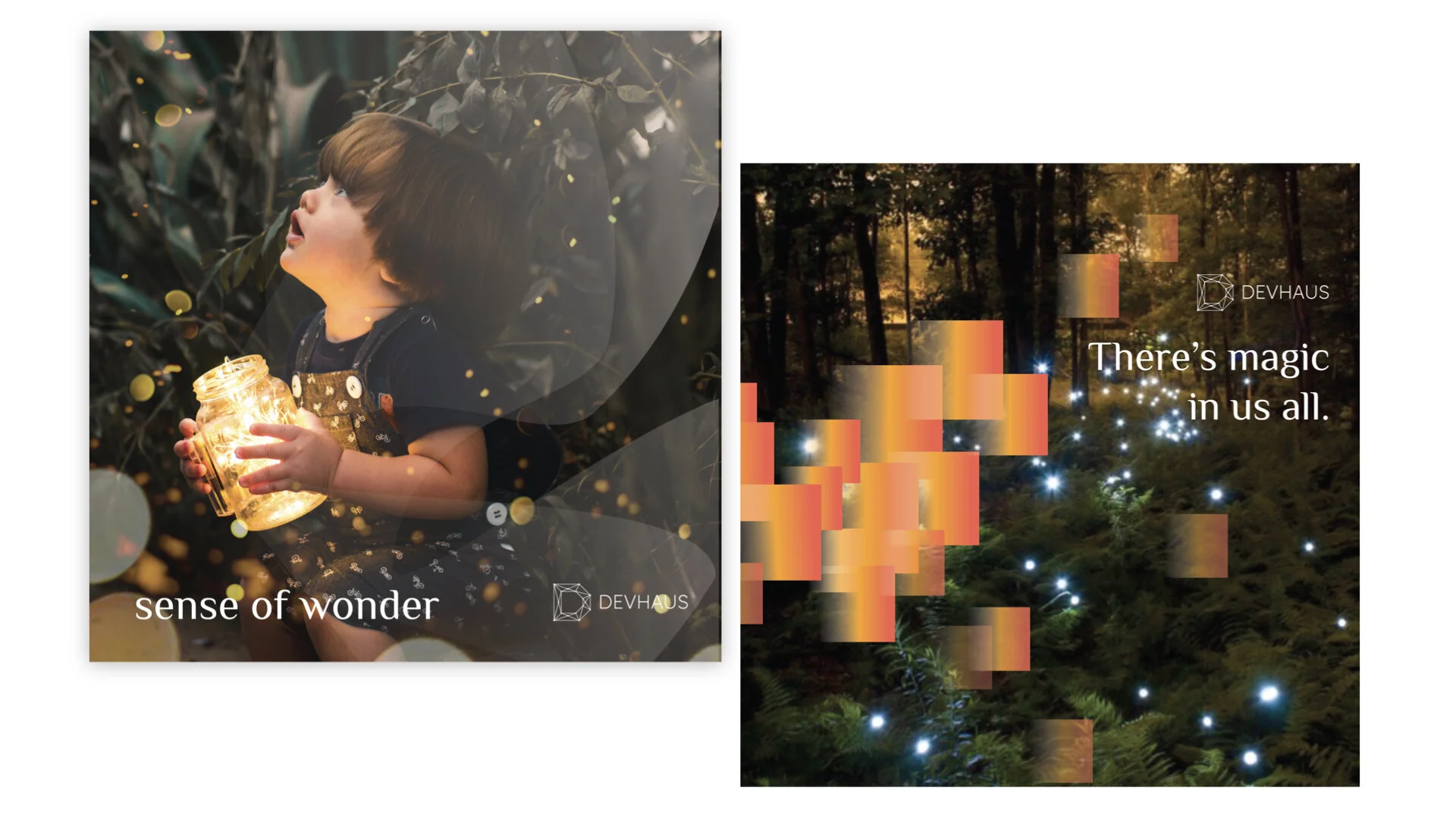
Our imagery is beautiful but believable. It should be clean and minimal but carefully composed to look like part of a natural environment – instead of staged with any props. Soft, directional and warm light creates an illuminated, real and magical moment. Whether it’s a friendly face or landscape, the imagery should be powerful and inspirational, while connecting with our audience – it should be attainable and look like it could be you in there.
Manifestation of the magic
The thousands of data insights, generated by the Devhaus learning model, float like little dots through the air, slowly coming together to create a simple and elegant composition – our butterfly. This butterfly is the manifestation of the magic that Devhaus helps you free. The roundness of the dots offsets the sharp lines in our brand mark, and the warmth of the orange from our colour palette illuminates the butterfly to create a soft and magical symbol.
Dot as data insight
The dots, as an extension of the butterfly, represent the thousands of data insights generated by Devhaus. They appear with the same yellow-orange gradient seen in the butterfly and resemble a trail of magical pixie dust.


